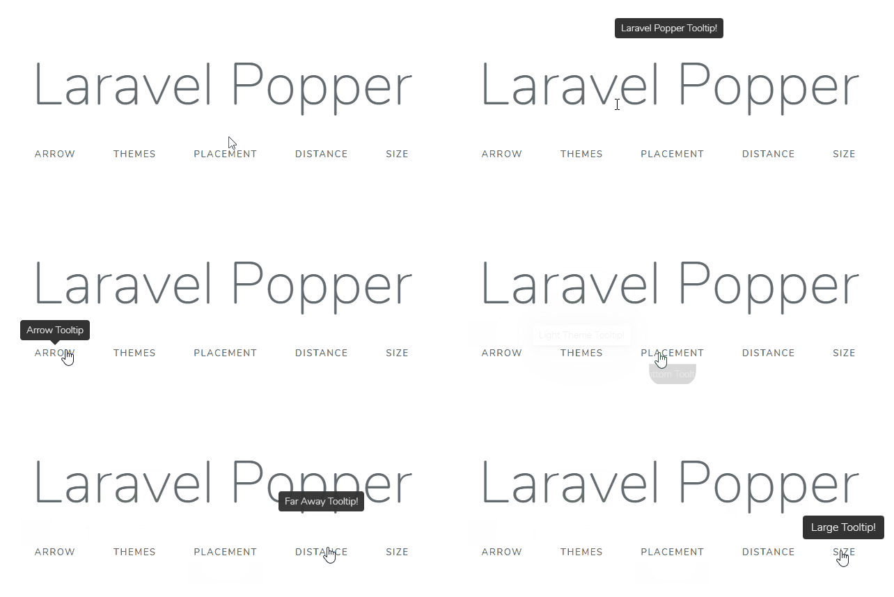
Laravel Popper
This package provides an easy way to add tooltips in your Laravel blade views. Powered by Popper.js and Tippy.js. With this, you will not lose time getting them done. Install and use, out of the box.

Install
First things, first… Use composer to install the package:
composer require andcarpi/laravel-popper
Setup
When composer finish his job, add the Service Provider and the facade to your app.config in the config folder:
Skip this if you use Laravel 5.5 and above.
'providers' => [
    // ...
    // List of Service Providers...
    // ...
    andcarpi\Popper\PopperServiceProvider::class,
],

'aliases' => [
    // ...
    // List of Facades Aliases...
    // ...
    'Popper' => andcarpi\Popper\Facades\Popper::class,
],
Usage
To use Popper in your view, you need to inject the assets needed!
Use @include('popper::assets') in the views you need tooltips, right before the body closing tag.
ps: If you have a Master View, add the assets on it :)
   @include('popper::assets')
</body>
Now, it’s time to use it. To generate a simple tooltip, just use the Popper facade inside any html element.
<button >Click Me!</button
Blade Directive
Another usage example is to use the @popper blade directive!
<span @popper(Span Tooltip!)> I'm a Span </span>
Configuration
Custom Tooltip Options
You can change the Tooltip default options publishing and editing the config file.
php artisan vendor:publish --provider="andcarpi\Popper\PopperServiceProvider" --tag=config
The file will be placed inside your config folder.
Each option is self-explanatory, and you can modify the default behavior of all the tooltips you generate.
Single Tooltip Options
Each tooltip can be customized using functions. They can also be chained!
- Enable Arrows in the tooltip ```
- Modify Tooltip Placement
- Modify Tooltip distance from the element
//Use integers!
- Modify Tooltip size
- Modify Tooltip Triggers (What will make tooltip appear)
// 1st param is mouseenter, 2nd is focus, 3rd is click
- Modify Tooltip Show and Hide Delay
// Use integer values!
- Modify Tooltip Theme
// ‘light’, ‘lightborder’, ‘google’, ‘translucent’, ‘success’, ‘danger’, ‘warning’, ‘info’ // For the success, danger, warning, info, you can also use the Helpers (see next info) // If you are using themes, enable themes at the config file!
- Simple Success, Danger, Warning, Info Popup Helpers
- Enable Tooltip Interactivity
- Options Chain!
```
##
This package is powered by Pooper.js and Tippy.js
License
Laravel Popper is open-sourced software licensed under the MIT License (MIT). Please see License File for more information.
Todo
[x] Danger / Warning / Success , etc pops
[] Custom Theming